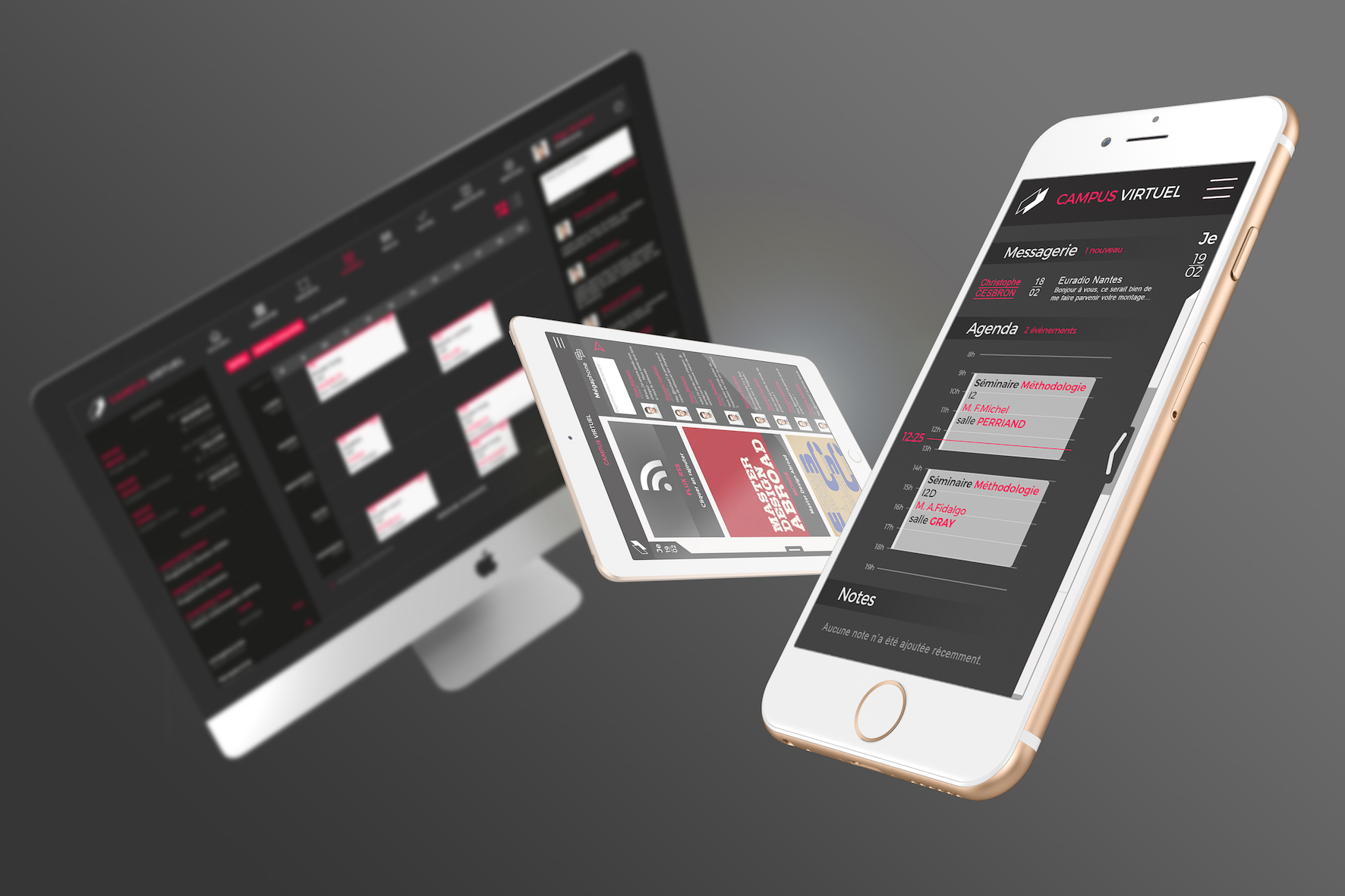
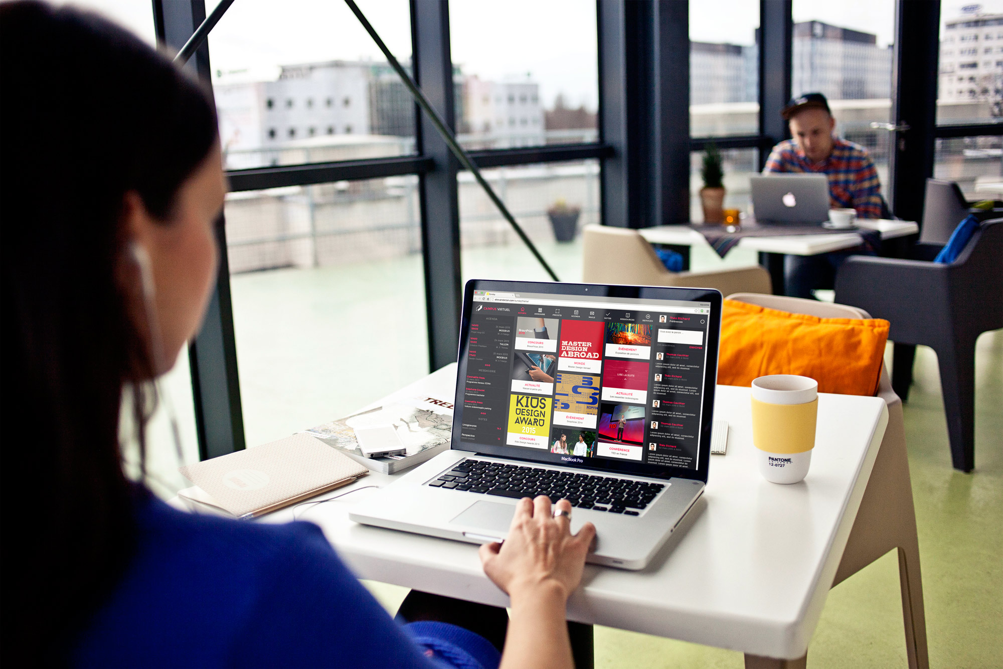
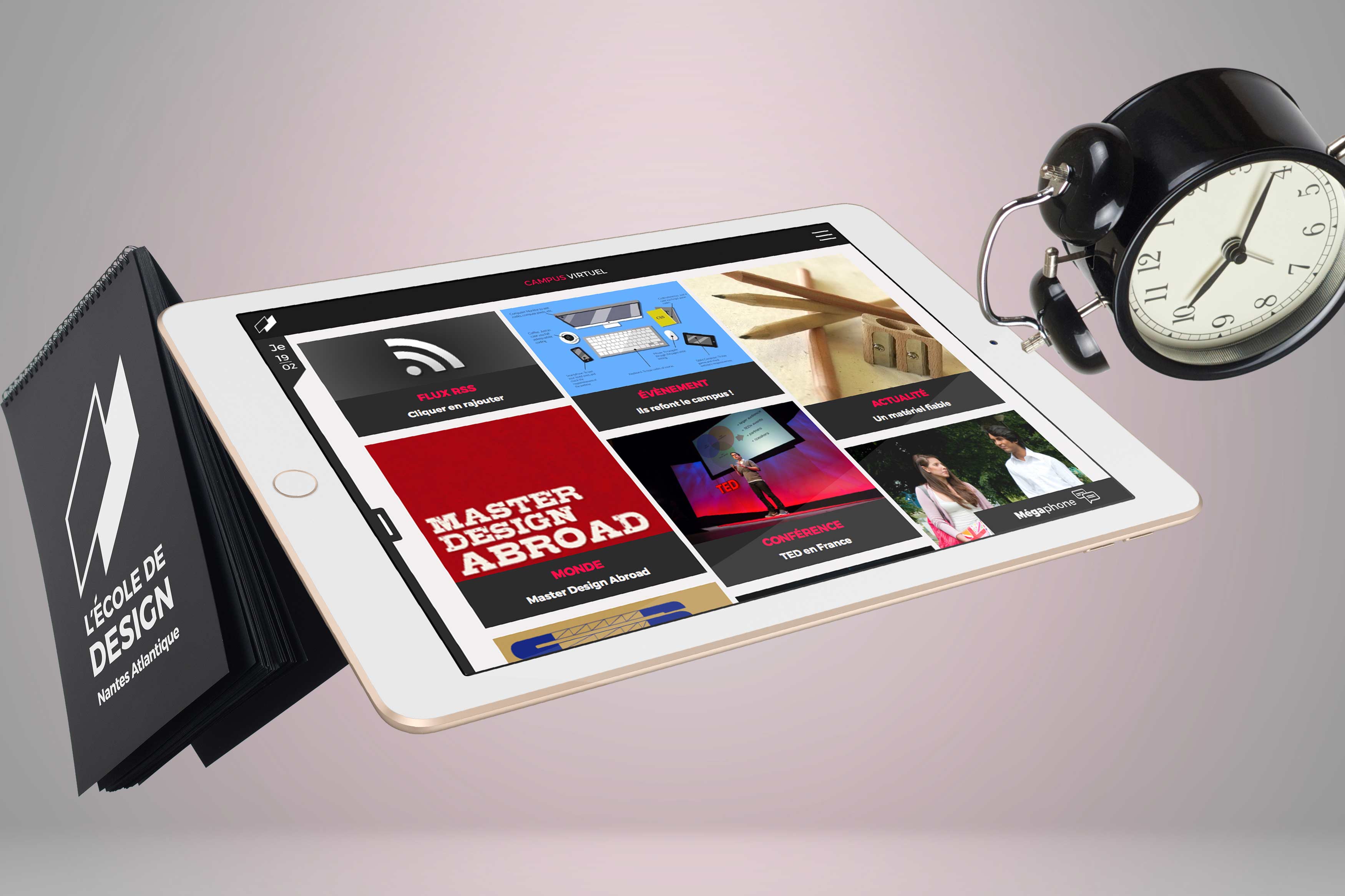
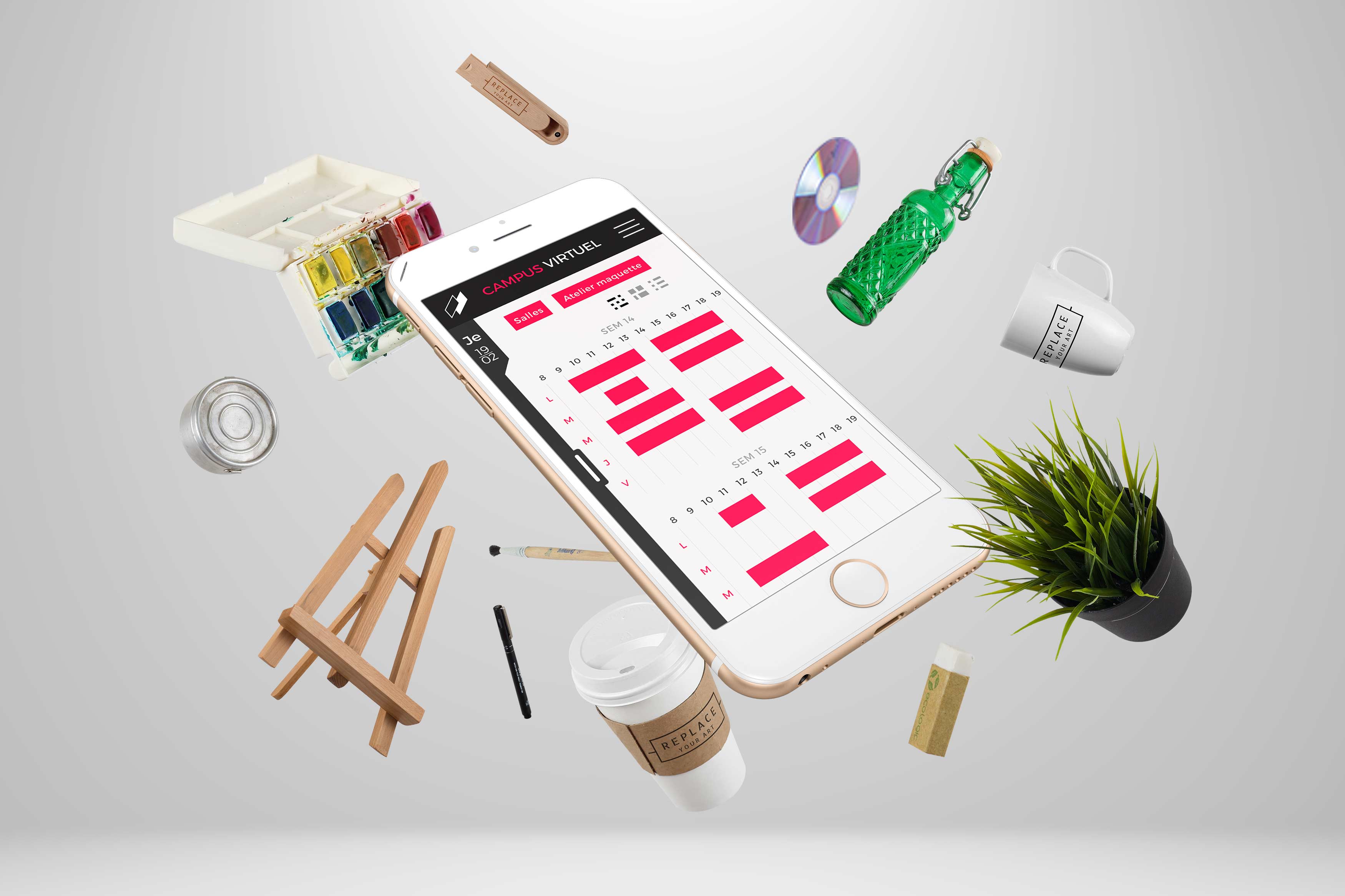
We had to rethink the school's platform at several stages. First, we had to know which tools were slightly used or not (the advantage is that we already knew this website) taking into account the fact that mobile use is not necessarily the same as the desktop version: the mobile is mostly used to quickly look for information as rooms or schedules. The challenge was therefore to organize the content and have a logical structure tree that quickly leads to information.